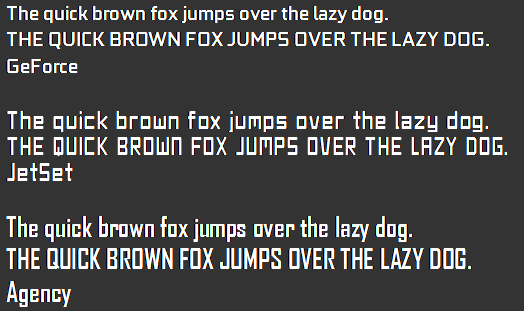
these are full Tribes1 native fonts that work with all versions (1.11/1.30/1.40/etc)
i started these about a year ago, did about 90% of 'em and then got into some drama and forgot about it
until i recently found them on a portable HD i'd left at a friends house
slapped 'em into a config and i thought they looked pretty cool so i took some screens")
GEForce:
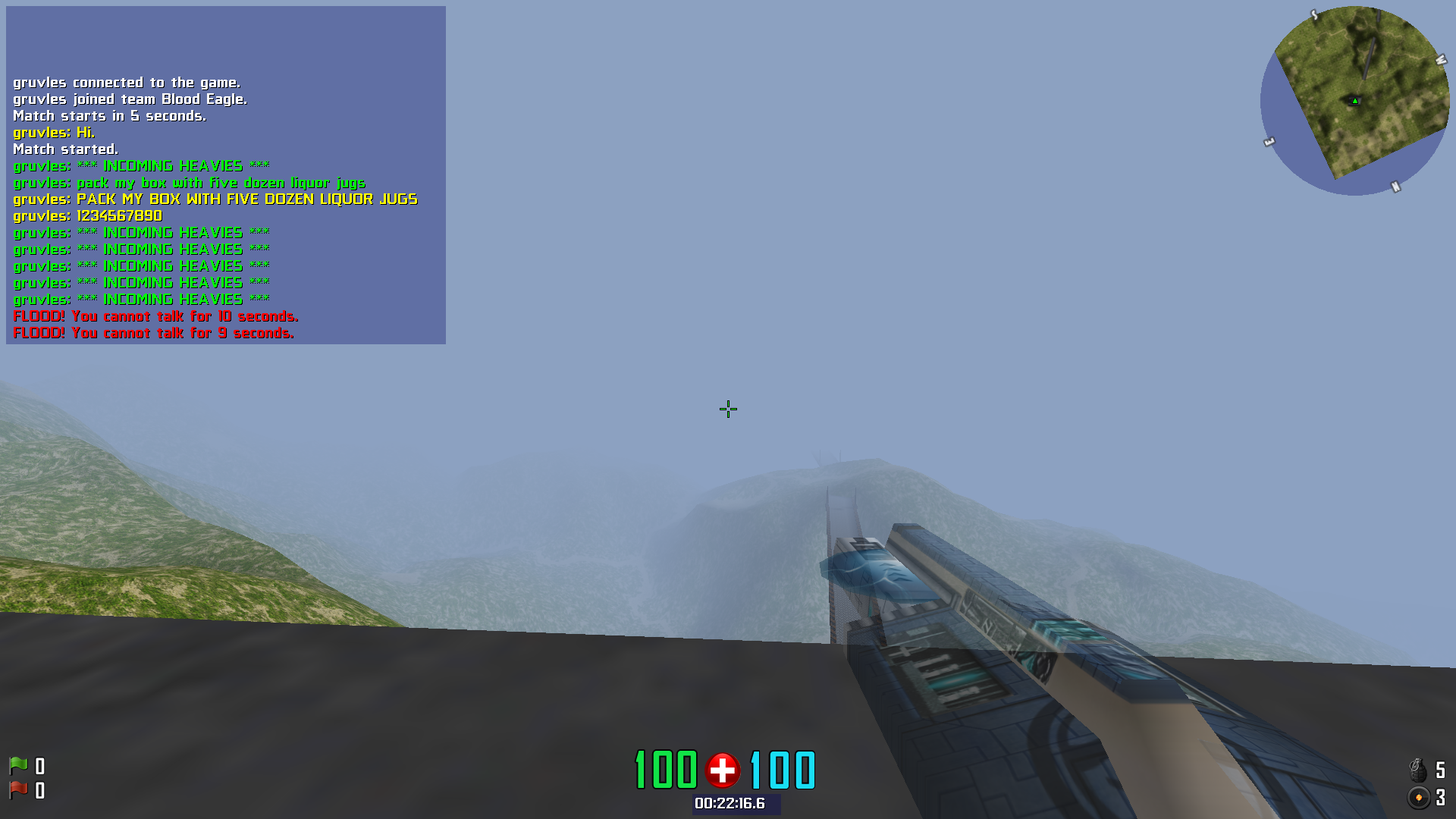
AgencyFB
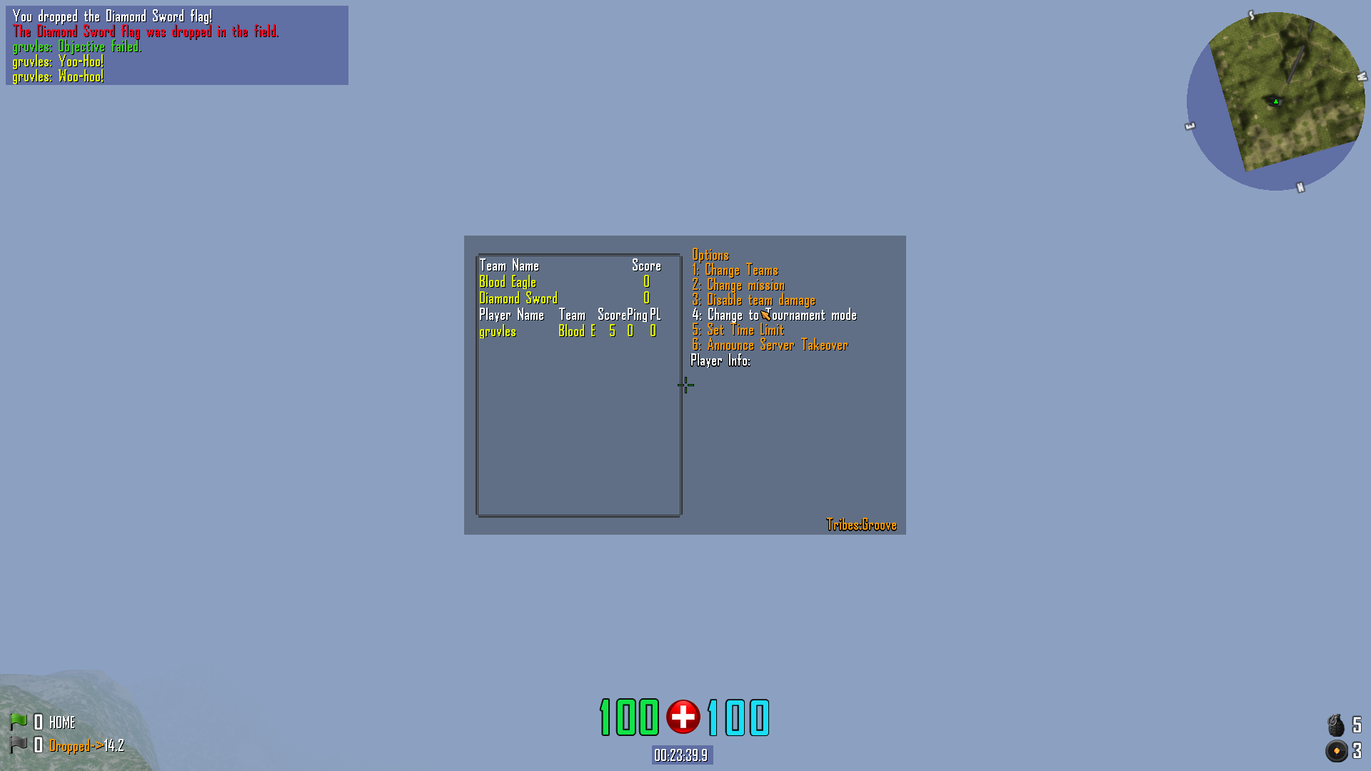
also larger version of AgencyFB giant BMP so i didn't hotlink
still a few unfinished chars and i dont feel like doing it now but hopefully release next week?
:heart:
i started these about a year ago, did about 90% of 'em and then got into some drama and forgot about it
until i recently found them on a portable HD i'd left at a friends house
slapped 'em into a config and i thought they looked pretty cool so i took some screens
GEForce:
AgencyFB
also larger version of AgencyFB giant BMP so i didn't hotlink
still a few unfinished chars and i dont feel like doing it now but hopefully release next week?
:heart: